HomeStory
Integrated Real Estate Search Platform
Role
Lead Designer
Overview
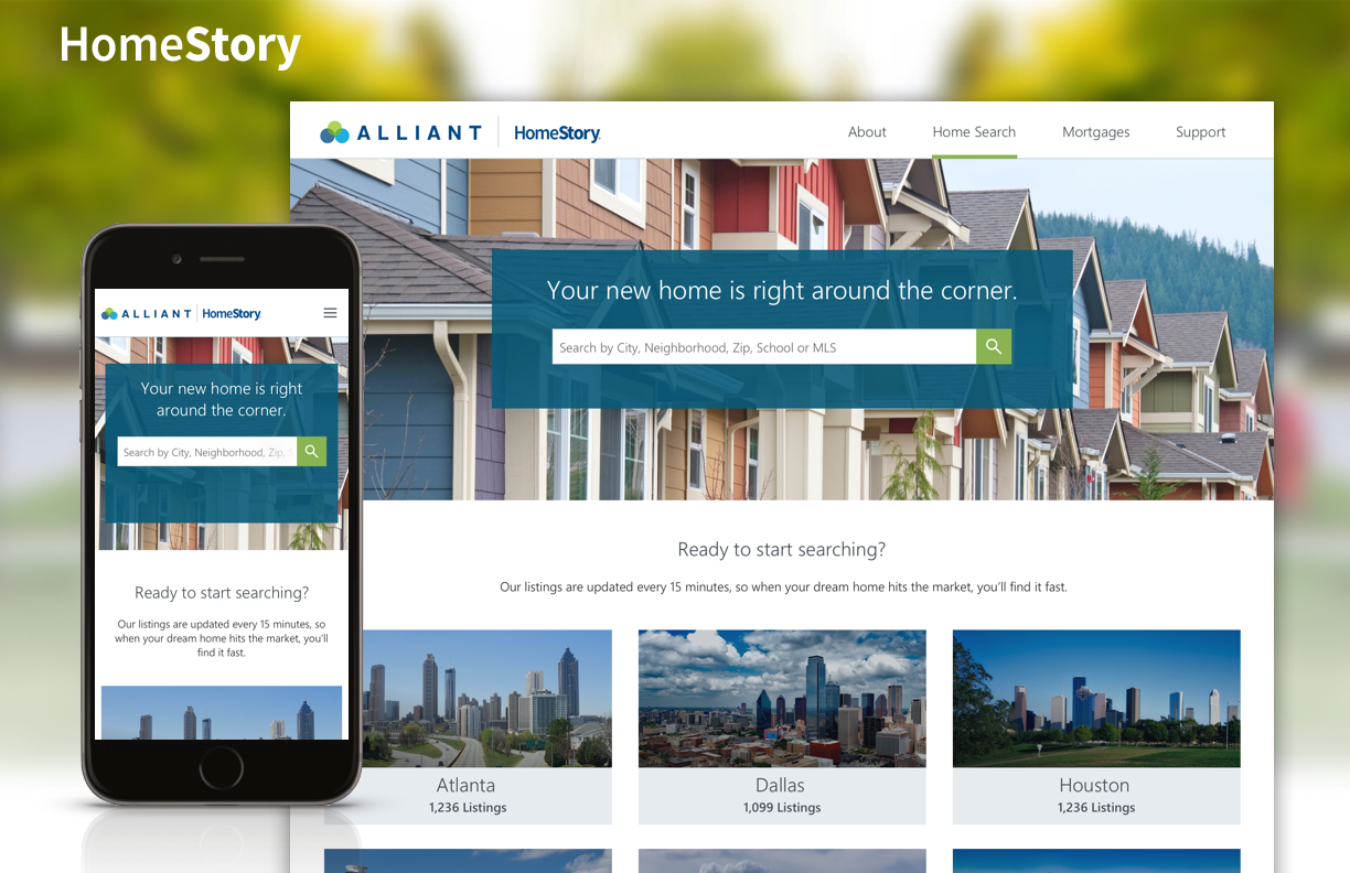
HomeStory offers a real estate search platform that is branded and integrates with bank websites to help boost mortgages and provide a full-service experience for users. HomeStory is a responsive, web-based solution.
Live Versions
TD Bank | Alliant Credit Union
Prototypes
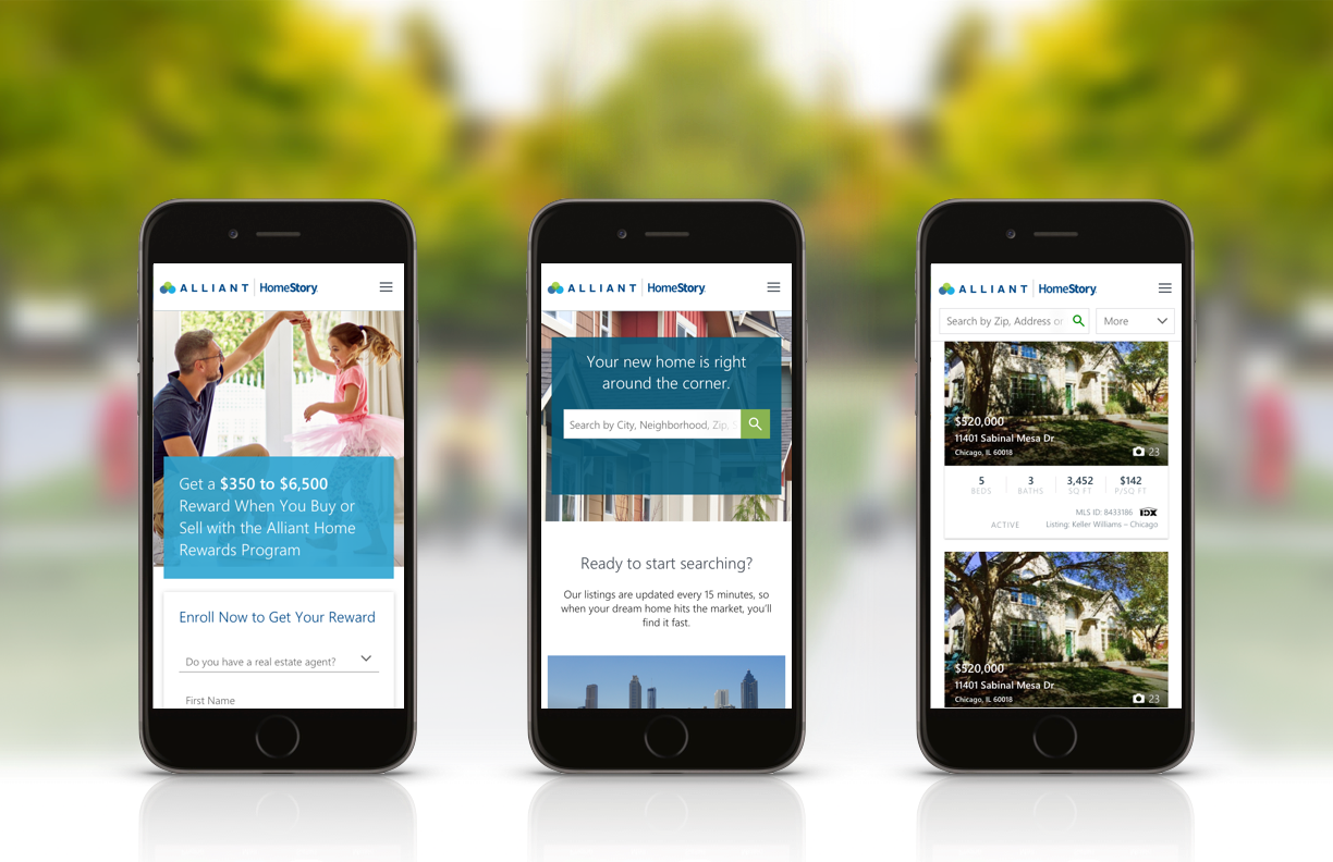
Alliant Mobile | Alliant Desktop
Problem
Searching for a home is a time-consuming and overwhelming process. Most people who are looking for a home start their journey online. They start by poking around websites and apps like Zillow, Trulia or Redfin and then eventually wander over to their bank’s website to look into their financial options. Maybe they decide to get prequalified. Then what? We found that there is a significant drop off after prequalification. Most of these home buyers end up getting a mortgage through another lender, and banks are left wondering where their customer went. HomeStory offers transparency between Mortgage Loan Officer, Real Estate Agent and buyer. For consumers, HomeStory is the perfect platform to have all of their information in one spot. On top of that, they are matched with a highly-qualified real estate agent and dedicated loan officer to help with all of their financial questions. As a final incentive, HomeStory offers a cash reward for closing on a home within the program.
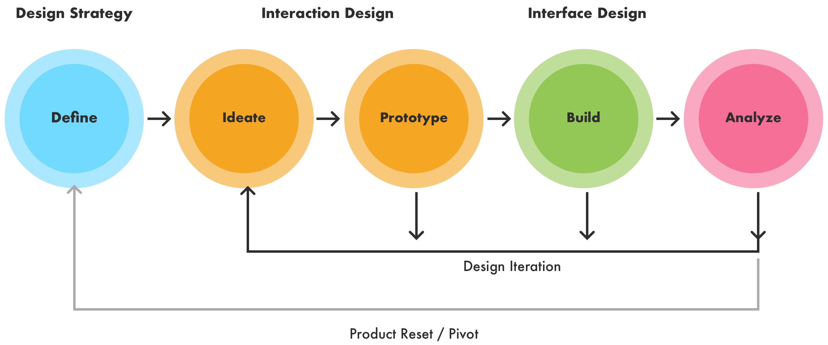
Process
We knew that we needed, at the very least, a search experience. We also needed a dedicated place to explain the program details and entice people to enroll in the HomeStory program. In order to reach the bank’s current consumers, we implemented email campaigns and social ads, and included various entry points from the bank website and mobile app to HomeStory. The search experience also needed to be branded to match the bank’s website to create a seamless integration between our platform and the bank’s site.
HomeStory | Alliant from Allison Boozer on Vimeo.
Iteration
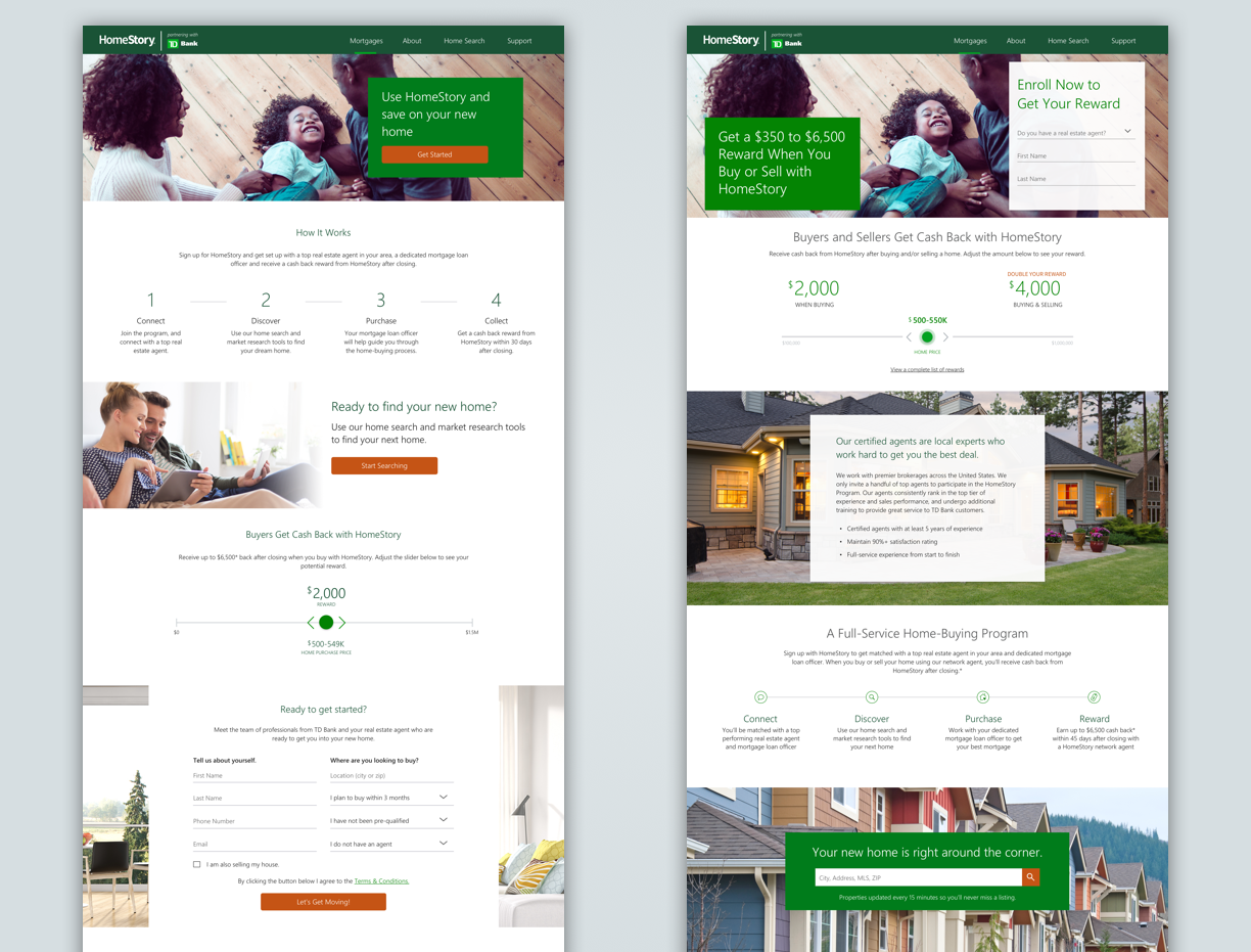
After launching with our first customer, we discovered that our program landing page needed some content tweaking. We also saw a very high drop off between the bank’s website and the HomeStory website, mainly due to a scary looking popup alerting the customer they were headed to a third party website.
We suggested a friendlier design of the speed bump and also redesigned some elements on the program page to improve engagement. Top of the list: creating a multi-stage enrollment form optimized for mobile. This Framer animation was provided to engineers to demonstrate user interaction.


